Role
UX/UI Product Designer
Timeline
5 months
Figma, FigJam, Lyssna, Uxtweak, Dovetail, Zoom, Google Meet, Excel
Tools

The Flavor Behind The Idea
A travel app for those who explore the world through food.
FoodiePath is a responsive web app that connects foodie travelers with local culinary experts for real-time recommendations. It helps users explore hidden culinary gems through video, audio, or text consultations, while giving experts a platform to share their local knowledge and grow their audience.
But how did this idea come to life, and what challenges did we need to overcome to bring it from concept to reality? I’m excited to take you on the journey of designing FoodiePath.
What´s The Story?
The Challenge I am Solving
Foodie travelers need a way to discover hidden culinary gems and authentic dining experiences. Culinary experts, meanwhile, need a platform to showcase their expertise and connect with travelers seeking local, authentic food because mainstream platforms often prioritize tourist-driven options, leaving travelers overwhelmed and experts struggling to reach their target audience.
My Recipe for A Solution
FoodiePath aims to bridge the gap between curious travelers and knowledgeable locals. It empowers users to discover under-the-radar dining experiences, while offering experts a space to promote their insights, manage bookings, and earn from their passion—through a clear, human, and interactive platform.
With this challenge in mind, I focused on creating a solution that’s not only functional but also engaging and intuitive.

Before Designing, I Looked Around
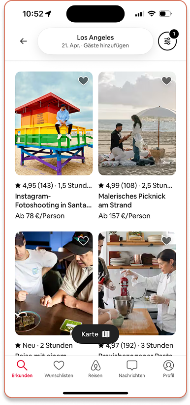
To design a meaningful solution, I first looked at existing platforms used by travelers and local experts. This competitive analysis helped me spot key gaps and opportunities to design a more personal, trust-driven experience.
AirBnB Experiences
Strengths
Wide global reach and trusted, diverse experiences, including food tours.
Weaknesses
Food options are hidden among non-food ones, making them hard to find.
Threats
Platform saturation limits visibility for small, independent experts.
Opportunities
Can expand curated food content to better serve foodie travelers.
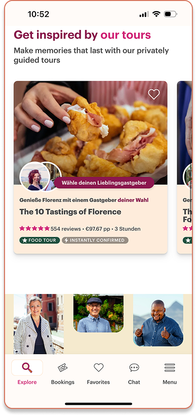
Withlocals
Strengths
Connects travelers with locals for unique, often food-focused experiences.
Weaknesses
Lacks real-time or on-demand options; bookings need planning.
Threats
Faces competition from niche platforms offering faster, flexible bookings.
Opportunities
Could add live video, audio, or chat for quick, tailored tips.
Authenticity & Access
Empower passionate locals, not just professionals, to share unique, insider recommendations.
Seamless Experience
Design for intuitive browsing, quick expert access, and minimal decision fatigue.
Culinary Focus
Position as a niche platform dedicated exclusively to local food discovery.
Real-Time Connections
Offer flexible consultation options—video, audio, and chat—for on-the-go support.
Key Takeaways

Time To Talk To Real People
Before jumping into design, I needed to validate the problem and my initial assumptions. So, I conducted three user interviews with both foodie travelers and culinary experts to deeply understand their needs, frustrations, and expectations.
Travelers Seek Local Flavor, Not Tourist Traps
Foodie travelers are tired of generic suggestions—they want authentic, hyper-local food experiences from people who actually live there.
Experts Want Visibility Without the Noise
Culinary experts struggle to stand out on crowded platforms. They want a dedicated space to share their passion and connect with the right audience.
Key Takeaways
Trust = Transparency
Users are skeptical of anonymous reviews. Trust builds through detailed expert profiles, clear pricing, ratings, and visible engagement.
Connection Should Be Flexible
People appreciate multiple ways to connect—whether it’s a quick text, an audio tip, or a live video chat. Convenience is key.

Meet The Key User Types
After synthesizing insights from the interviews, it became clear that two distinct user groups have overlapping, but unique needs. To design a product that truly serves both sides, I created user personas to represent their goals, frustrations, and behaviors.
Jamie
foodie traveler
"I want dining experiences that feel personal and memorable—without the stress of endless research or worrying if I made the wrong choice."
culinary expert
Carla
"Every bite tells a story, and I want to guide people through the incredible tales of Portuguese cuisine."

Let´s Walk In Their Shoes
Knowing who my users are is just the start—now it’s time to explore how they experience FoodiePath. That’s where the user journeys come in.

Visualizing Their Next Moves
Once I understood what users were feeling at each step of their journey, the next challenge was mapping out how they’d actually move through the app. I used user flows to bring their experience to life—tracing how a traveler finds the perfect expert, or how an expert sets up a session.
"As a foodie traveler, I want to book expert, so that I can receive personalized recommendations for exploring the local dining scene."
"As a culinary expert, I want to respond to a booking request, so that I can confirm or modify the details of the session and provide personalized services to the traveler. "

Sketching The Big Picture
Through the development of personas, journeys, and flows, I asked myself — “How will all these pieces fit together once a user opens the app?”
I organized the possible categories and created first version of the sitemap . Then through a hybrid card‑sorting exercise with users, refined the sitemap around the groupings that felt most intuitive to them.
The result is a streamlined sitemap driven by "simplicity wins." As FoodiePath evolves, this map remains flexible, adapting to real user behavior.

Putting Pencil To Paper
During early sketches, I concentrated on core layout and functionality—building a straightforward MVP framework that users could understand at a glance. Those rough ideas then became mid-fidelity wireframes , where I digitized the sketches and corrected the first errors in my thinking.
Home/Dashboard - Traveler´s View
Explore Experts
Expert´s Profile
Home/Dashboard - Traveler´s View
Explore Experts

Bringing It To Life
With the mid‑fi wireframes were ready, I shifted into high-fidelity —locking in a grid, color system, and step‑by‑step style rules so every screen spoke the same visual language. I stitched this first version into an interactive mobile prototype, eager to see what usability testing would reveal once users could tap, swipe, and explore FoodiePath as if it were already in the wild.

Putting FoodiePath To The Test
With my first clickable prototype ready, I lined up a moderated remote usability testing. I prepared a test plan and script, and after conducting the usability testing, I compiled a detailed report. I invited seven participants to complete four key flows: onboarding and login, exploring experts, booking a session, and messaging with a review. Each participant worked through a mix of direct and scenario-based tasks while I observed and asked follow-up questions to uncover pain points.
What Did The Feedback Reveal?
After the sessions, I clustered every note in an affinity map, then ran the findings through a rainbow spreadsheet to spotlight the most critical patterns. The result? A clear, prioritized list of fixes and improvements to carry into the next design iteration.
Fixing The Big Four Issues I Discovered
From the rainbow spreadsheet several issues emerged as must‑fixes—here’s how I tackled four of them.
1. Unclear Functionality of the Search Bar
2. Pricing Information Difficult to Locate
3. Difficulty Finding Video Call Option After Booking
4. Difficulty To Find Filter Options

Bringing It All Together: The Final Mobile Prototype
After additional usability testing, addressing accessibility requirements, and incorporating feedback from my colleagues to refine visuals and micro-interactions, the successive iterations culminated in the final prototype: an intuitive, user-centered, and engaging product.
Crafting The Visual Identity: The Style Guide
With the prototype complete, I crafted a style guide to ensure visual consistency across the app. This guide included a warm color palette, clear typography, and defined button styles and micro-interactions, all designed to maintain an intuitive and engaging experience throughout FoodiePath.

FoodiePath Demo

Looking Back, Moving Forward
Throughout this design process, I learned that design isn’t about crafting the “perfect” product, it’s about the journey. It’s a continuous process of learning, testing, and refining, always driven by empathy and an understanding of users’ needs. Each step deepened my appreciation for iteration and the power of real insights to shape meaningful solutions.
As I look ahead, there are still exciting opportunities to refine and expand FoodiePath:
Run focused usability testing with culinary experts to validate current dashboard functionality such as replying to reviews, messaging travelers, and managing bookings.
Design additional prototype screens (including desktop screens) to complete the expert experience covering bookings, profile views, response time, messages, and earnings.
Enhance onboarding for both user types by introducing coach marks or contextual hints, helping travelers personalize their experience and guiding experts through the platform’s most-used features.
This case study marked a meaningful step in my growth as a designer and I’m excited to carry these lessons forward into the next challenge.


